Archie Comics Triple Digest: "Archie," "Archie in Hell," & "Sabrina the Teenage Witch" #1
Three time the reviews, three times the joy.
Three reviews over three weeks! Each Sunday, I will be moving the "preview" section farther down so that anyone can read these reviews. Paid subscribers are getting early access to these early reviews however. In fact, they already got them all! What a deal, at only $1.50 a month. That's less than a chocolate bar at this point...
Don't mind waiting but want to know when they're live? Become a free members and have all my thoughts and reviews and cat photos delivered directly to your inbox!
A new era begins and I am excited to talk about these three issues. Let’s dive right in.
Top level thoughts: I had a blast with all three debuts, even if I have my problems. Each one is distinct in their own rights, with unique takes on the characters while still seeming to have a unified sense of design. It speaks to the power of the “Archie look” that even though the fashion and tone and artist’s styles all vary, each book feels like an Archie comic.
I’m a fan of this approach, too. No shared universe. No big crossover plans. Just three solid titles that could appeal to different readers and will hopefully find their audiences. Good stuff all around! What about the nitty gritty though? You want to know whether I changed my mind about any of the titles. Well…here’s the “actually read the damn things” power ranking:
- Archie in Hell
- Archie
- Sabrina
If you read my update from a few weeks back, you’ll notice that my ranking is a little different now. Because I have quite a lot to say about “Sabrina” and its drop, I’ll save it for the end. First, “Archie,” written by Ben H. Winters, illustrated by Fábio Moon, colored by Jason Wordie, and Lettered by Andworld Design!
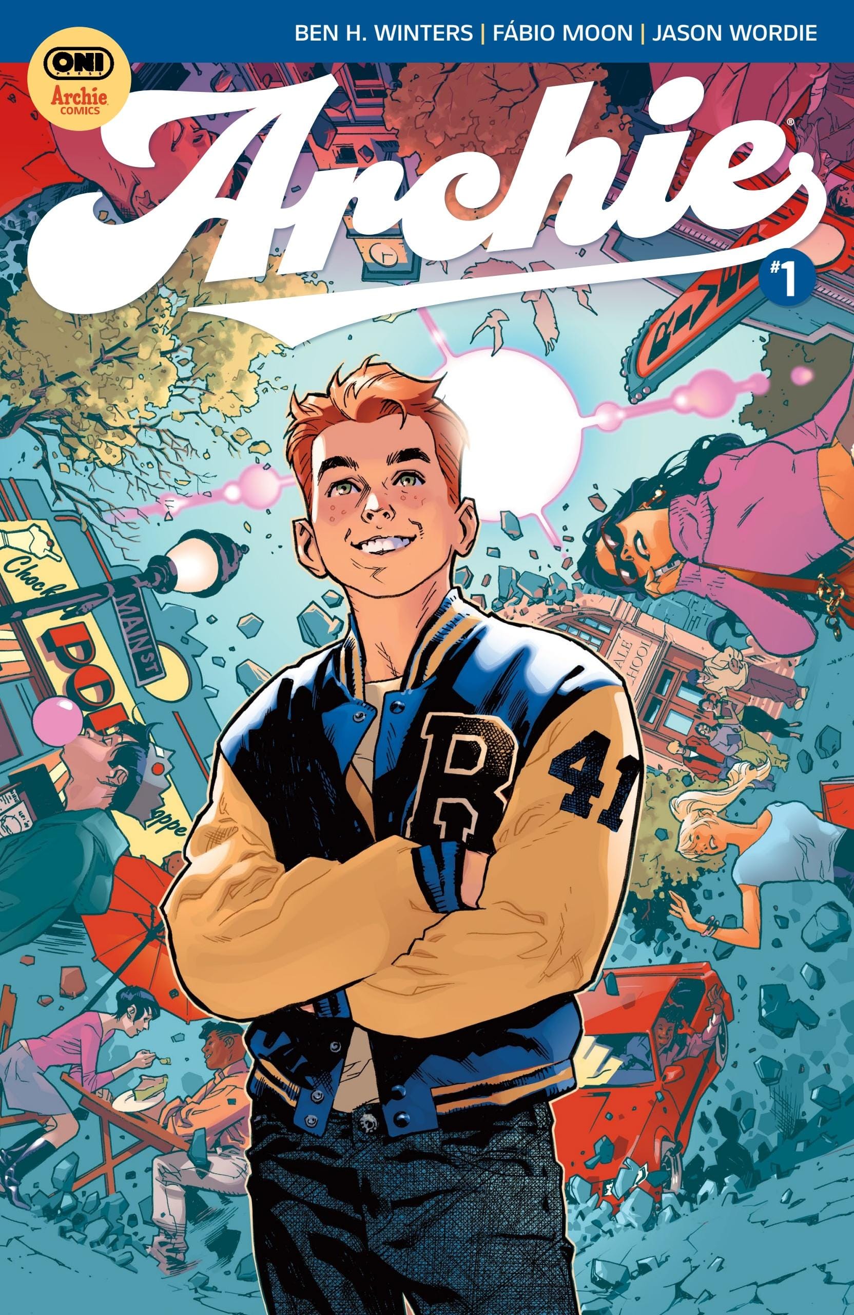
Originally I was going to take the comics in ranking order but, uh, “Archie” #1 is probably going to be out, or just about to be out, by the time you’re reading this. It’s going to be hard for me not to keep saying “I wish I knew what W. Maxwell Prince” would have done because I can see just how perfect his idiosyncratic writing style would be for America’s Teenager and Fabio Moon’s art. However! Winters is a natural at capturing the easy-going americana that is “Archie.”
This is a very earnest take on the character and his friends. It’s upbeat, it’s sit-comy, but it’s also self-aware of the reputation that Archie Comics has as being this trapped in amber unreality. The first story in the issue, ‘Rude Awakening,’ plays with this expectation beautifully, allowing Moon to indulge in some of the same visual flights of fancy he does in “Daytripper.”
Wordie’s colors are a wonderful fit, sinking into Moon’s art to give it that bright and soft, almost nostalgic feel. I particularly like the way he shades the characters. It’s hard to tell where the inking ends and the coloring begins. And Andworld’s lettering! Bouncy yet restrained, clear and simple, we’re in good hands with Andworld guiding us across the page.
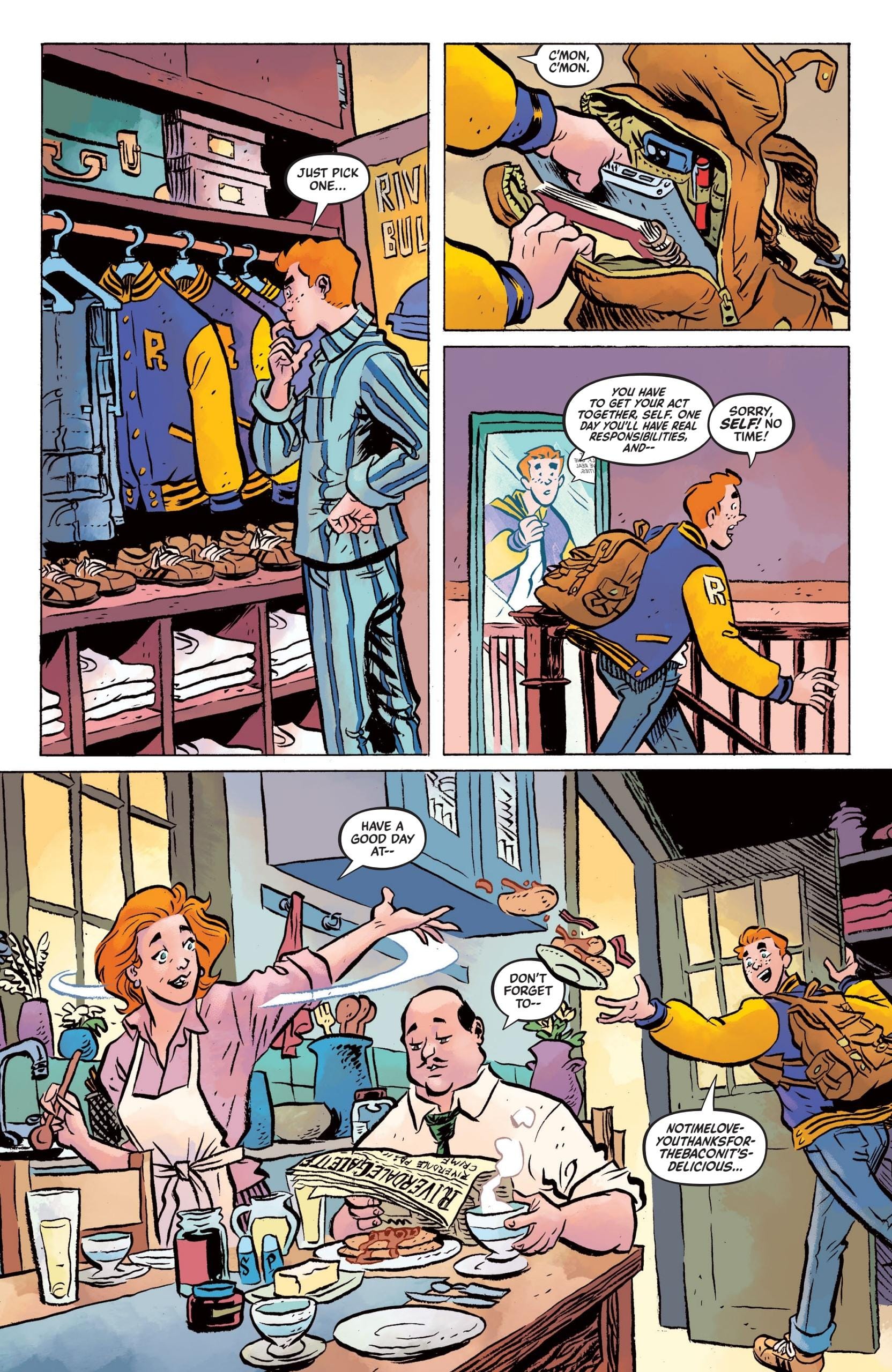
The magic of “Archie” #1 is in its effortless ability to acclimate readers new and old to the tropes of the Archie world. ‘Rude Awakening’ does some of this, though that’s more a mission statement on how Winters & Moon are approaching this era. Homage to the past, bringing us into the present. ‘Yes, We Cannes!,’ by contrast, gives us a better idea of Archie’s friends, who they are, and who he is in relation to them.
Reggie is a bit of a self-aggrandizing musclehead, Veronica is an ambitious and spoiled schemer, Dilton is a pie-in-the-sky nerd, Jughead is the laid-back, faithful friend and Betty is the supportive friend-next-door. Even with their differences and friction points, they’re clearly friends with Archie and that’s all we really need to know right now.
The last story, ‘Jughead’s Journal: Part 1,’ is all about the future. Taking a small cue from the broodier aspects of Cole Sprouse’s interpretation on Riverdale, these scant few pages of pensive pondering by Jughead about life after high school and the carefree days at Pop’s close the issue on a note of bittersweetness and foreboding. It’s distant and it's minimal but that touch of darkness reminds us that nothing lasts forever, not even the world of Archie…but there’s still plenty of time before one has to worry.
For now, sit back with your friends; enjoy a shake and some burgers; and cherish the time you’ve still got.
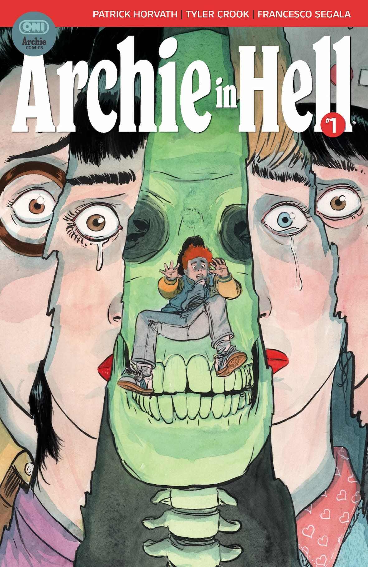
Our second comic is “Archie in Hell” and wowie zowie did this one catch me off guard. Written by Patrick Horvath, illustrated and lettered by Tyler Crook, and colored by Francesco Segala, this is the darkest of the three debuts (naturally.) The main cover has a screaming Archie being burnt at the stake after all. But that image obfuscates the quieter nature of the issue.
Horvath has been carving out a niche as the quiet horror guy. He gets the pathos of the human condition and puts it on the page, moving us even as the events of a page unsettle and repulse. He brings these otherworldly fears to the mundane, to the human, by slowing it down, turning the volume low, getting us to lean in and process, really process, what we’re seeing. Horvath’s “Beneath the Trees” works as well as it does because it’s at our pace (and because Samantha is an amazing POV character.)
So does “Archie in Hell.”
Psychological horror is the name of the game more than an out and out fright fest ala “Afterlife with Archie.” It’s a slow burn build-up that foregrounds the characters rather than the inevitable horrible events to come. Sure, its structure is predictable to anyone that’s even remotely familiar with cult horror staples but, like watching an expert magician, the team does their trick with the such confidence and skill one has to be in awe of what’s taking place right in front of their eyes.
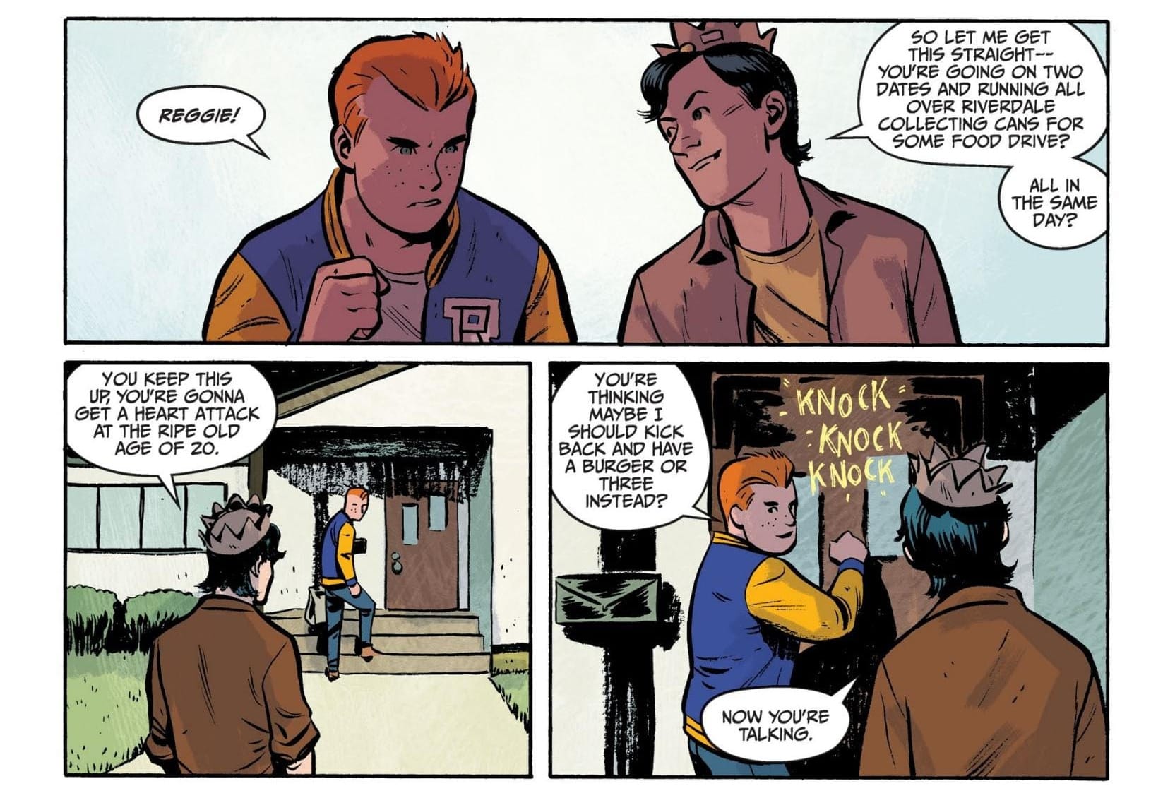
Half the issue is Archie running around town getting food for a “food drive!” It’s so mundane it would be funny if the team didn’t keep the horror elements foregrounded…for us. Archie & co have no idea what’s going on. They’re living in Riverdale, the town with pep. The eternal sitcom. Sabrina, though, is Greendale, a spookier vintage that flirts with the horrific. The two coexisting as they have in (mostly) recent years provides the friction as one reality bleeds into the other and we are left to witness the incursion.
In terms of the story, the team crafts delicious dramatic irony rather than a bait-and-switch scenario. There is no surprise when Archie is kidnapped and the very well telegraphed scam food drive turns out to be a scam. We knew it was coming but Archie is too nice, too naive, to doubt and so a pit forms in our stomach as the question isn’t “what’s happening?” It’s “How bad will this get?”
This is not to say the comic eschews the bright red stuff and nightmarish imagery. There’s a dude who vomits blood out of a second head that pops out of his mouth Xenomorph-style into the hollowed out severed-head of Principal Weatherbee for crying out loud! It’s just judicious with these visuals, relying instead on the creeping sense of dread to set the mood and strong character writing to seal the deal.
The fear in Reggie’s eyes as he’s driving through town, the panicked spells of Sabrina, the tears of Jughead, and the build as we watch Archie drive ever closer to the prophesied doom, never in doubt, but always just distant enough we can convince ourselves he’s going to be fine. The opening page even has a mini moment of paranoia, laying the seeds for Archie’s “disappearance” with a fakeout that I only really clocked a few pages in.
This is Archie, after all. Nothing bad ever happens to him for too long, right?
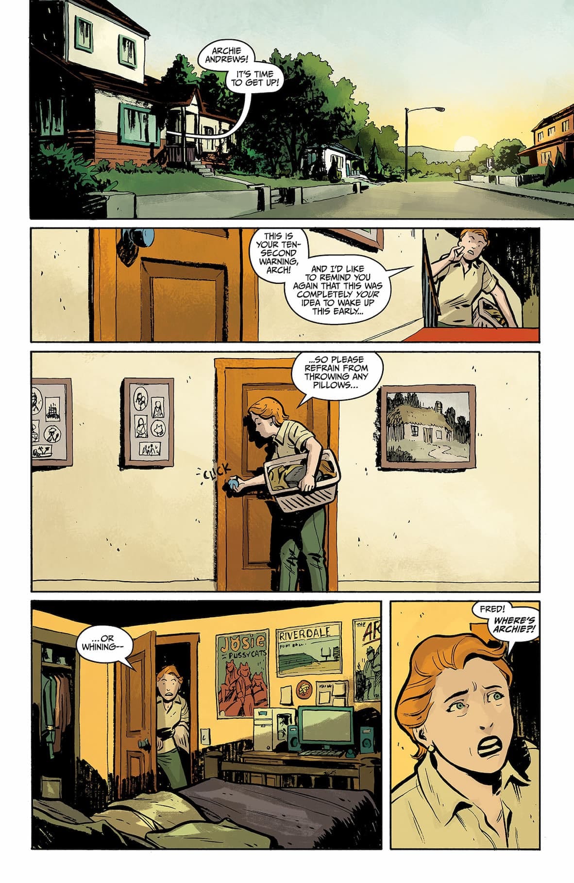
Crook was the perfect pick for “Archie in Hell.” I mean, he’s a no brainer for horror at this point, particularly when it calls for character nuance. He can do the wide-eyed (or more often, button-eyed) innocence of Archie Andrews, the quiet rage of Reggie Mantle, the recklessness and confidence of Sabrina Spellman. Crook can do haughty and down-to-earth and terrified and he will make you believe that Reggie cares about Archie as much as Jughead, Veronica and Betty, even if he won’t show it.
And then he’ll draw an upsettingly well-composed shot of a headless corpse at the end of a hallway.
I gotta say though, it’s weird seeing Tyler Crook not color his own work. I was actually trying to put my finger on why the book felt off for the first couple pages and then it hit me. Crook’s style is so intertwined in my head with watercolors and those deep, earthy greens that the brighter, flatter coloring style of Segala took a minute to get used to. It’s great stuff, especially in the back-half of the book. It’s moody and a little giallo with those rich, dark reds and crackling yellow/white lightning.
And it all comes together in the final few pages to absolutely throw out all expectations of what a title called “Archie in Hell” will be. I wonder who our Virgil will be?
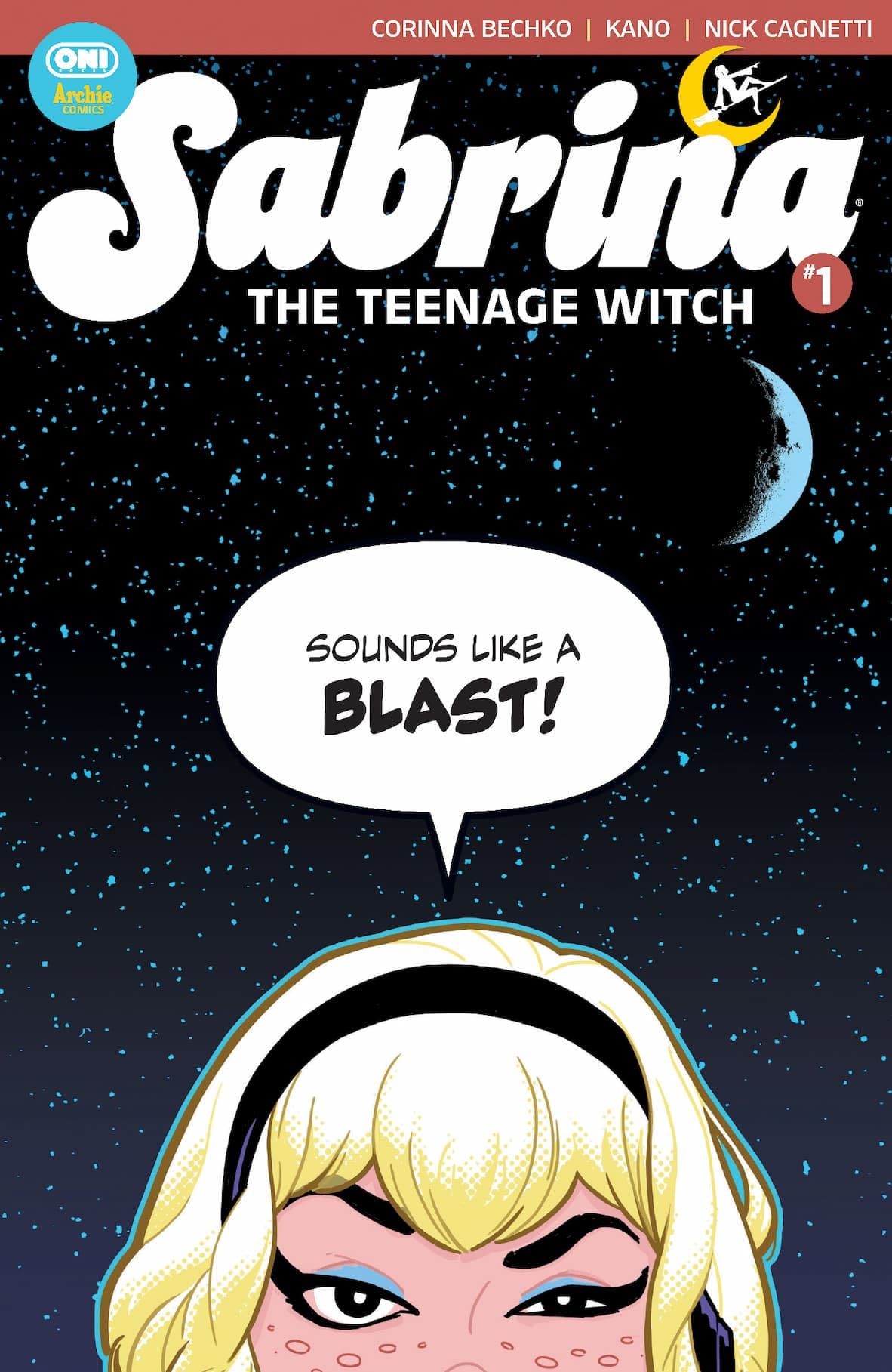
Alright. I’ve avoided it long enough. Let me address that sharp drop for “Sabrina the Teenage Witch” #1, written by Corinna Bechko, illustrated and colored by Kano, and lettered by AndWorld's DC Hopkins (with the backups illustrated and colored by Nick Cagnetti.)
When the books were first announced, Kano’s flat, pop-art infused cover was a huge draw for me. It screamed chic and cool and I could not wait to crack the book open, particularly after I remembered he did a bunch of excellent “Gotham Central” issues. The art inside did not disappoint, though there are panels throughout that were more unfinished than I would have liked. Mostly this manifests as an over-reliance on solid colored backgrounds rather than a simple environment. They have their place, of course, but these are haphazardly strewn throughout every page so Sabrina will often be floating in a void.
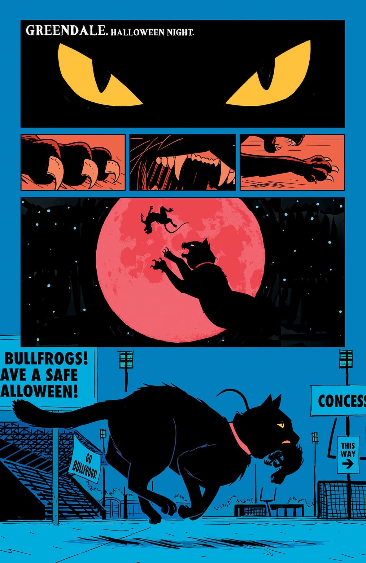
I’m also really bothered by the breaking of the 180 rule on page 1, which I know is more of a rule of thumb, analytical tool. This has slowly become a pet peeve of mine over the last few years. Artists, please, PLEASE, pay attention to the direction of action (or conversation!) as it waterfalls down and across the page. Salem jumping at the moon is a sick panel. Him jumping in the complete opposite direction that he was traveling in the prior panels creates frustratingly unnecessary friction to the line of action.
In this case, it doesn’t impede the clarity of the page but where it does is on page 9. Sabrina has accompanied two of her friends, Harvey and Lou-Ella. We’re behind them as they’re walking through the crowd. Harvey is turned to talk to Lou-Ella, asking if she wants a drink…and then in the following panel we’re in front and he and Sabrina are drawn on opposite sides of each other from the previous panel, completely blowing up the spatial geography and leaving me very confused as to who he was talking to. Perhaps the idea is they were both turning around and we, the reader, haven’t actually moved much? If so, the closeness of the panel did that action no favors.
I didn't even realize he was talking to Lou-Ella rather than Sabrina, which is also a failure of the dialog to clarify since Harvey has basically, exclusively been talking to Sabrina, and the inclusion of the many, many bottles in the foreground makes it seem like him turning is to acknowledge said drinks, not Lou-Ella. It’s small but moments like these build and compound.
I hope future issues are able to rectify this. I’ve been assured by the advanced review copy emails that “Sabrina” and “Archie in Hell” are working copies so some of my critiques could be ironed out by then - like if parts of the coloring are, in fact, truly just the flats - though I suspect what they mean is “see a typo? Don’t worry ‘bout it.”
What’s less easily fixed are the structural weaknesses of this issue.
Bechko does a fine job of introducing us to both sides of Sabrina: the teenager and the witch. This is a Sabrina who’s just starting out. In fact, she’s just now learning about her witchiness! And as any good teenager is wont to do, she wants nothing to do with all that newfound responsibility and complications to her social life, not to mention the fragile perception of her peers. She just wants to party, hang, and be a regular ol’ teen.
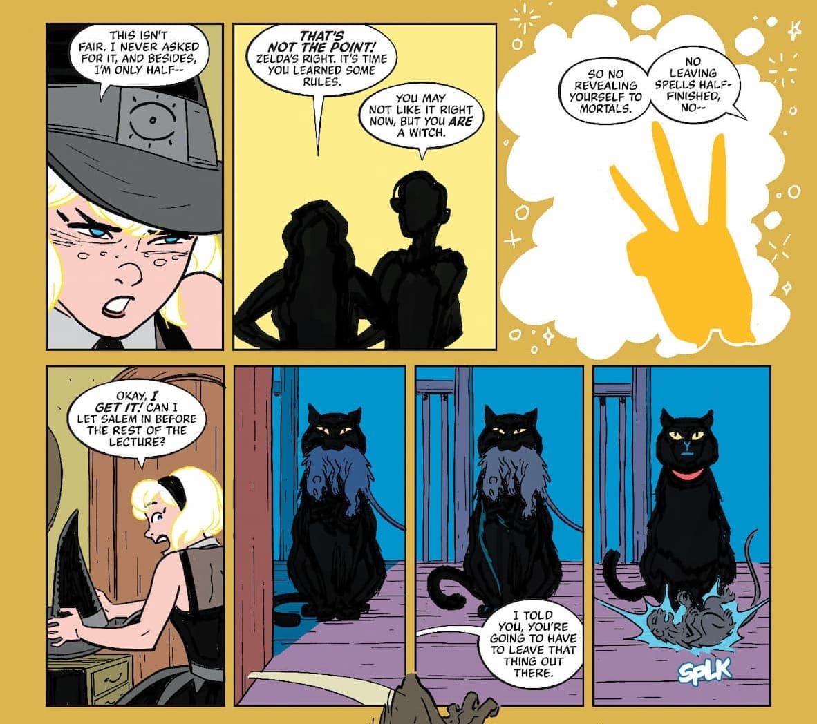
There’s the seeds of a mystery regarding some Evil Gross Rat Creatures, one that’s tied into Sabrina’s awakening as a witch; an event that’s kept frustratingly distant and vague. The entire time I was reading, I felt like I had missed a scene. Like there was some prequel short that I needed in order to fully get what was happening. Why does the comic need to play coy with what happened? What benefit is gained?
It’s one thing to drop us off in-media-res or even obfuscate some prior, major occurrence for the sake of simplicity. It’s another to heavy-handedly hint or talk around a formative, plot-relevant moment all for the sake of a mystery box opening. To do it well, there have to be enough concrete moments to hold onto in the text to allow a reader to feel comfortable sitting back and going “oh, we’ll find out more later.” That is not present here.
It’s weird to say I wish I knew less. I like all the Salem scenes, I like the scene with Sabrina and her aunts, but those are scenes that work only when both the characters and the readers have the proper context. Sabrina going to a party and being attacked by rat creatures? A good hook! She’s the only one who sees it that way? A better hook! Leave it at that. Or show a couple panels of the relevant moment of the event at the start and a reaction shot of Sabrina thinking about it, maybe one that we glean more from than she does.
Still, I stand by the above.
The dialog is similar, with conversations that just…skip whole trains of thoughts and bounce back and forth and expect us to follow the hidden leaps taken inside their minds. The rhythm isn’t quite there, even if said leaps are completely normal for regular conversations. Another dialog pass could be enough to tighten it up.
As I said at the top, the aesthetic and bones of the comic are good. There is enough here to like to continue reading. I’m invested in the teen drama and the comedy is (mostly) a success. The character work is impeccable thus far and I love how Kano is rendering the magical elements. His faces are so expressive too. Plus, those backup magazine pages by Nick Cagnetti are great.
The team gets what Thompson & the Fish’s got too: a little bit of horror, a lotta bit of fun. Dark shadows and poppy colors; the witch and the teenager, finding a balance. We’re still in the groundwork stage. Sabrina’s still learning. Let’s see how much more she has to do before she can find that equilibrium.
Comments ()